The City of Omro uses OpenGov Software to prepare their annual budgets. OpenGov has now connected with our financial software to give us the ability to provide up to date financial information to the public.
Click HERE to check it out!
Tutorial
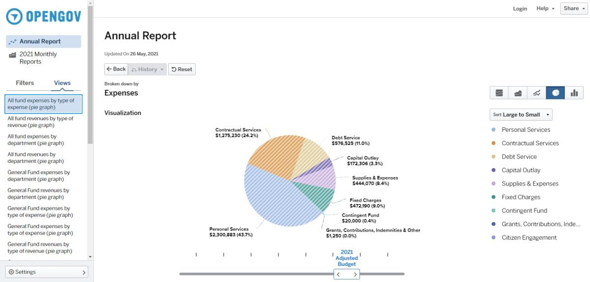
When you open the portal using the link above, you will see a screen similar to the one below (though it may be on a different report). If you notice on the left, there is a column that lists the reports available. The types of reports are listed directly below the OpenGov symbol. Clicking on one of these gives you more options to choose from under the Views tab. Scroll down and click on the report you would like to see. One of the more useful reports would be General Fund Expenses by Department (Pie Graph) as this is where most of your tax dollars go and it doesn't mix in the Water and Sewer Departments.
Once you are in a report, you can change the type of graph displayed by choosing from the options on the top right of the screen. Maybe you would rather this was a line graph or a bar graph? Try them out!
In this case, you are looking at a pie chart for expenses in all funds by the type of expense. If you were to click on the portion of the pie labeled Supplies & Expenses, you would see a new pie graph that breaks down that category further. Alternatively, you can click on the titles on the very right and achieve the same result.
Just below the chart there may be a sliding scale. You can switch into different years, months or perhaps budgets vs actual numbers.
At any point, hit the back button below the title "Annual Report" to go back to where you were previously.
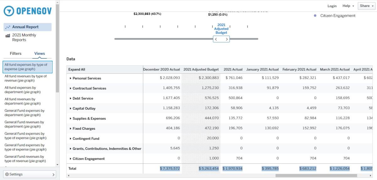
If you scroll down below the graph, you will see a spreadsheet, which is another way to look at the chart. Use the sliding bar at the bottom of the spreadsheet to see more columns. If you want to dive further into the data, click on one of the arrows in the description column or see everything by clicking on the words "Expand All".
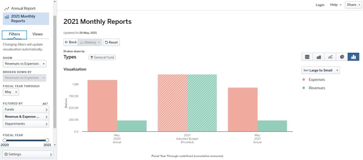
One of the more popular reports will be under the 2021 Monthly Reports option. The first report listed is the General Fund's YTD revenues and expenses compared to the previous year. This is continually updated and shows how we are doing compared to the budget. Please keep in mind that shared revenues and taxes come in late in the year, so your revenues are often going to be lower than expected. Hovering over these charts will give you the actual expenses and revenues to date and clicking on them will bring you more data by type of expense or revenue.
Once again, there is a spreadsheet below the graph that you can use to look at the data.
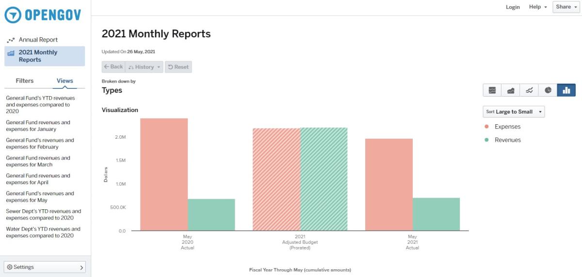
For the adventurous among you, click on the Filters tab in the left column to manipulate the data into something you might be looking for.
In the picture below, you can see that Filters is chosen and the different report views are no longer showing. In this case, I am still in the General Fund YTD Revenues and Expenses report. I can now choose to show just expenses, for example. I can then say broken down by department, by fund or by type of expense. I can pick a different month to show the data. I can also pick and choose which funds and departments I want to see by playing with the Filtered By area.
Don't worry about messing things up, this portal will bring you right back to where you started just by hitting the reset button or hitting refresh on your browser!
Please call Linda at City Hall, 920-685-7000, if you have questions or concerns. I hope this opportunity for us to provide transparency in our governmental funds helps you to understand where your tax dollars and fees are going and gives you a chance to be involved in the process!